


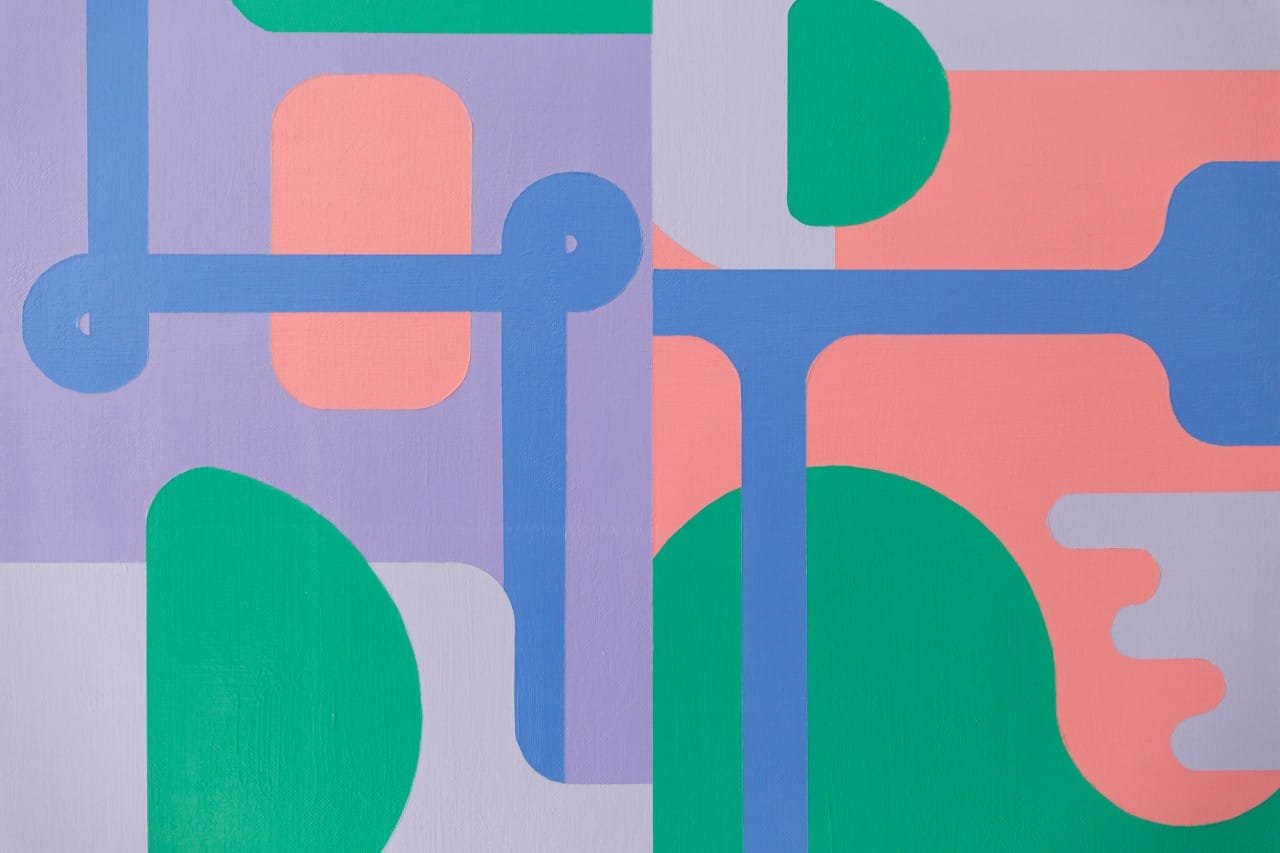
Adrian Banu approaches painting with a perspective shaped by two seemingly different disciplines: analytical thinking and visual practice. Before establishing himself as a painter, Banu spent more than 15 years working in the corporate environment after earning a BS in Marketing. He subsequently developed a professional career in photography, producing imagery for restaurants, hotels, cafés, food brands, and clients seeking documentary and artistic wedding photography. These experiences cultivated a highly attentive understanding of composition, light, surface, color, and visual structure, qualities that continue to inform his approach to painting.
From Photography to Painting
Although photography and painting operate through different technical languages, Banu’s artistic development reveals a clear connection between the two. His years behind the camera required him to understand how controlled lighting could transform an ordinary subject, emphasizing particular shapes, surfaces, expressions, or chromatic relationships. In his paintings, that same sensitivity is translated into a constructed visual environment.
Rather than relying on spontaneous gesture alone, Banu frequently begins with mathematically precise sketches that establish the underlying architecture of a composition. Lines, angles, proportions, and intervals are considered before the painting reaches its final form. This process reflects his analytical background while allowing intuition to enter through the selection and interaction of color, texture, and surface.
The result is a practice positioned between calculation and expression. Geometry establishes the parameters, while color introduces atmosphere and emotional resonance.
The Language of Geometric Abstraction
Hard-edged geometric abstraction has become Banu’s preferred visual language. His compositions frequently employ clearly defined forms, controlled contours, and carefully calibrated relationships between positive and negative space. Yet the precision of these structures does not make the work emotionally detached. Instead, the geometry provides a disciplined foundation from which perceptual and atmospheric effects can emerge.
The influence of the Bauhaus can be recognized in Banu’s interest in functional geometry, ordered composition, and the relationship between visual elements. Op Art contributes another dimension, particularly through the potential of geometric arrangements to alter perception and create visual movement.
His paintings therefore invite the eye to move between individual forms and the larger structure. A shape may appear stable when considered independently, while its relationship to surrounding forms introduces subtle tension or optical activity. Symmetry can be interrupted by asymmetry, while repetition can establish rhythm without becoming mechanically predictable.
Precision and the Expressive Power of Color
For Banu, geometry and color are not separate components. Their interaction forms the central tension of his practice. Precisely constructed shapes provide a sense of order, while color determines how those shapes are perceived and emotionally experienced.
This relationship can be traced back to his photographic practice, particularly his use of artificial lighting to control the visual impact of a subject. In painting, however, there is no external light source required to define the composition. Instead, Banu builds the visual conditions directly into the work through color relationships, surface treatment, tonal transitions, and reflective details.
Subtle textures and metallic accents are particularly important to this process. Rather than functioning simply as decorative additions, they introduce changes across the surface that become more apparent as ambient light shifts. The painting can therefore behave differently throughout the day, with certain areas becoming more prominent or reflective depending on the surrounding conditions.
RETRO PASTEL
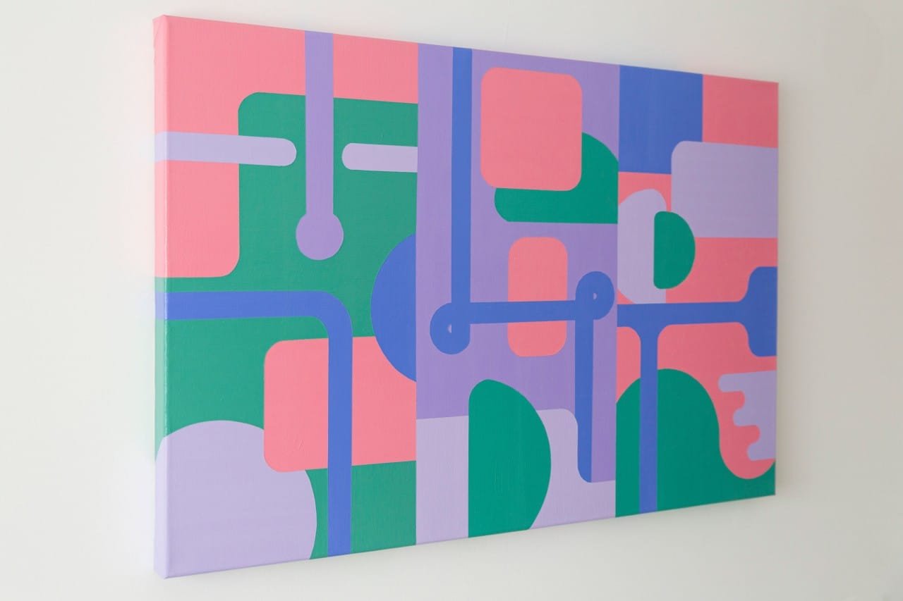
RETRO PASTEL represents Banu’s current approach particularly clearly. Measuring 90 × 60 cm, the acrylic painting on stretched canvas combines hard-edged geometric abstraction with fluid lines and a restrained pastel palette. The canvas is finished with painted borders and is ready to hang, reinforcing the artist’s intention for the work to function as a complete visual object rather than merely an image contained within a frame.
At first encounter, RETRO PASTEL establishes a quiet atmosphere through its pastel tones. The palette suggests calmness and serenity, but its associations extend further, evoking the visual vocabulary of nostalgia and retro-futurism. There is something familiar in the softness of the colors, yet the geometry points toward an imagined technological environment.
This tension between past and future is central to the character of the work. The forms possess an industrial quality, with clearly delineated structures that recall mechanical systems, architectural components, or robotic design. Their precision suggests an engineered environment. Yet the softness of the palette prevents the composition from becoming austere.
Instead, Banu places two seemingly contrasting visual ideas into dialogue: industrial geometry and pastel delicacy.
Between Symmetry and Asymmetry
One of the defining characteristics of RETRO PASTEL is its balance between symmetry and asymmetry. The composition is governed by a strong sense of order, but it does not depend on perfect bilateral repetition. Individual forms shift in relation to one another, creating variation within an underlying system.
This approach gives the painting a controlled sense of movement. The eye encounters clearly defined shapes but is encouraged to trace their relationships across the canvas. Fluid lines soften the rigidity of the geometric structures, allowing the composition to retain a sense of continuity.
The resulting visual language is neither entirely mechanical nor entirely organic. It occupies an intermediate space where calculated forms acquire a more atmospheric presence through color and surface.
A Contemporary Dialogue with Bauhaus and Op Art
Banu’s work demonstrates how historical movements can remain productive within contemporary painting without being treated as fixed stylistic formulas. The principles associated with Bauhaus and Op Art provide him with a foundation, but his practice extends those ideas through his personal history in photography and his interest in changing surface effects.
The mathematical planning of his compositions recalls the rational organization associated with geometric modernism, while the optical relationships between forms connect his work to the perceptual concerns of Op Art. Yet the use of pastel tones, metallic details, subtle textures, and references to retro-futurist aesthetics gives the paintings a distinctly contemporary character.
In this sense, Banu’s paintings are not simply exercises in geometric precision. They investigate how precision can become expressive, and how an ordered structure can still generate atmosphere, memory, and emotional response.
An Evolving Visual Practice
Adrian Banu’s journey from corporate analysis to professional photography and eventually painting has produced a practice in which observation and structure remain closely connected. His paintings translate the controlled attention of the photographer into a medium where geometry, color, and materiality can operate simultaneously.
RETRO PASTEL captures this direction with particular clarity. Its industrial forms, softened palette, carefully organized geometry, and interplay between symmetry and asymmetry reveal an artist interested in the point where calculation gives way to perception. The work is precise without being rigid and atmospheric without abandoning structure.
Through this balance, Banu continues to develop a visual language in which mathematical order and expressive color coexist, creating paintings that engage both the analytical eye and the imagination.

